Brand Identity Design.
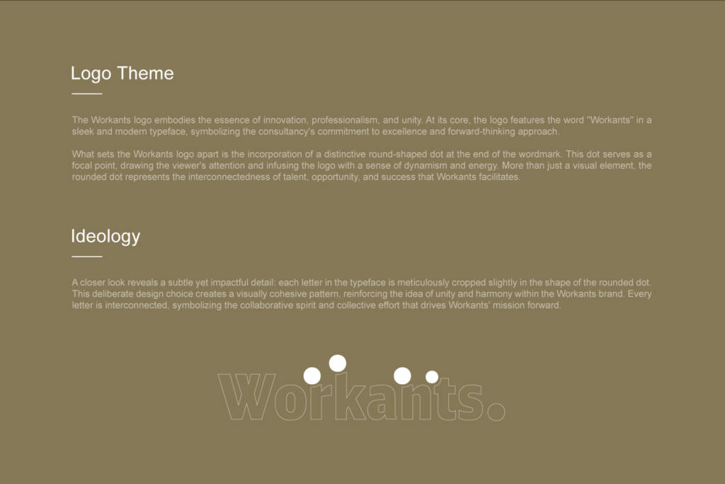
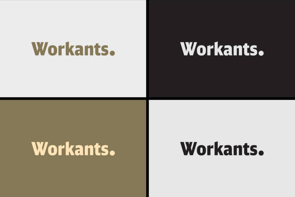
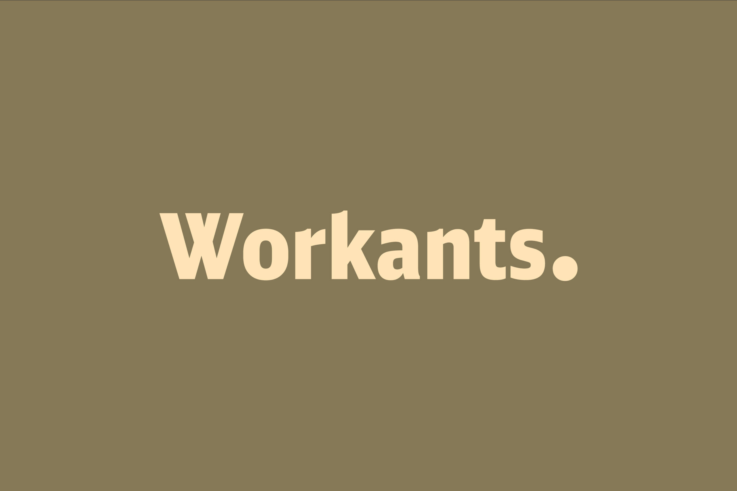
The Workants logo embodies the essence of innovation, professionalism, and unity. At its core, the logo features the word “Workants” in a sleek and modern typeface, symbolizing the consultancy’s commitment to excellence and forward-thinking approach.
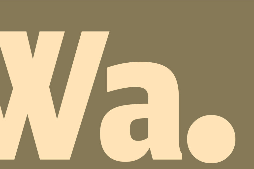
What sets the Workants logo apart is the incorporation of a distinctive round-shaped dot at the end of the wordmark. This dot serves as a focal point, drawing the viewer’s attention and infusing the logo with a sense of dynamism and energy. More than just a visual element, the rounded dot represents the interconnectedness of talent, opportunity, and success that Workants facilitates.
Ideology:
A closer look reveals a subtle yet impactful detail: each letter in the typeface is meticulously cropped slightly in the shape of the rounded dot. This deliberate design choice creates a visually cohesive pattern, reinforcing the idea of unity and harmony within the Workants brand. Every letter is interconnected, symbolizing the collaborative spirit and collective effort that drives Workants’ mission forward.