Brand Identity Design.
Design Inspiration:
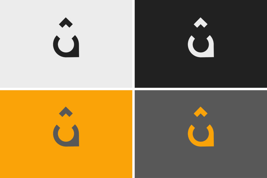
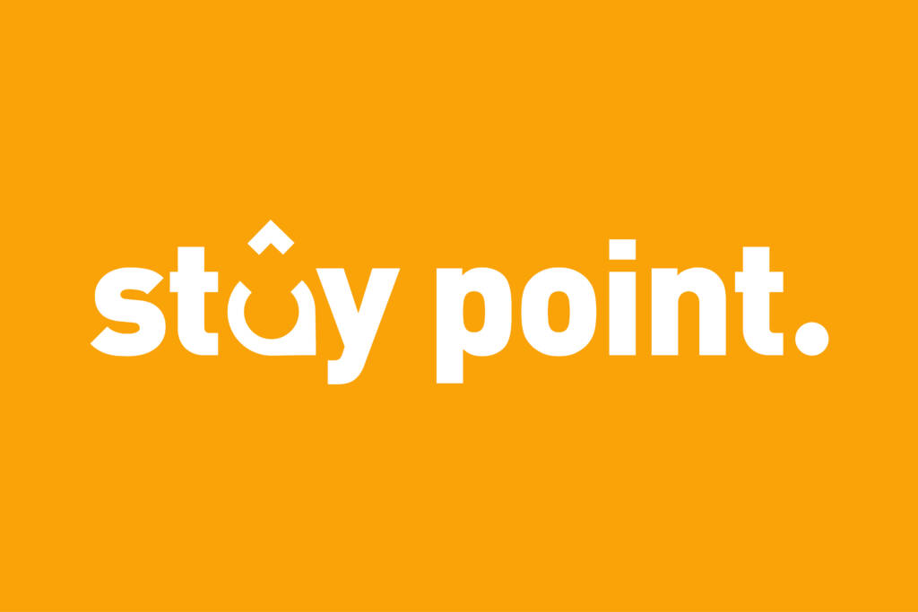
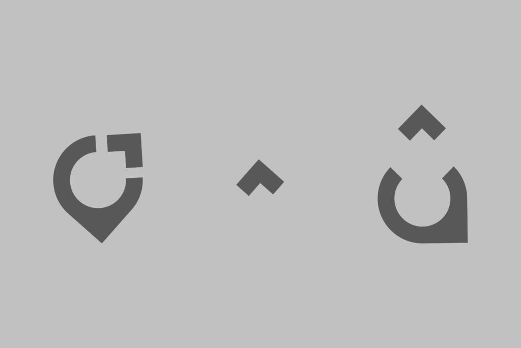
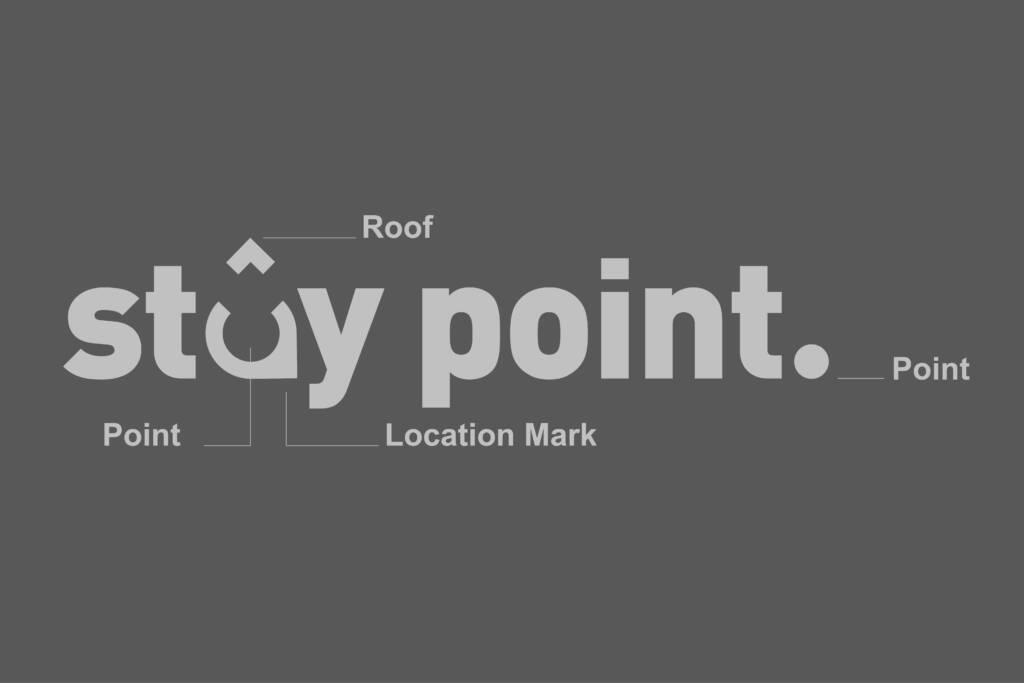
The central element of the logo is the letter “A,” designed as a fusion of a location marker and a roof. The location marker signifies accessibility and guidance, symbolizing a destination for travelers, while the roof conveys the idea of home-like comfort and shelter.

Concept Significance:
This combination perfectly represents “Stay Point Rooms” as a brand that offers a trusted haven for travelers—a balance between modern functionality and warm hospitality.
Typography:
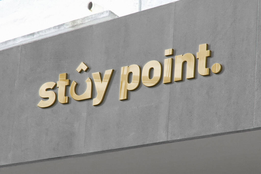
The bold and clean typography enhances the brand’s reliability and professionalism, complementing the symbol’s minimalist yet impactful design.
Color Palette:
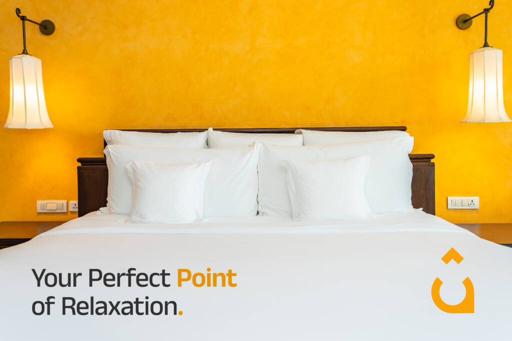
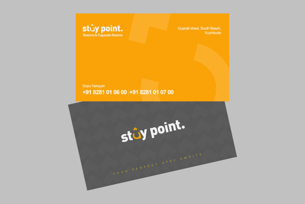
The colors chosen emphasize warmth and trust, reflecting the welcoming and dependable services of Stay Point Rooms.
